Skip to main
Article
OddBird's GitHub Project Board

Auditioning GitHub Projects

With the release of kanban-style project boards, we decided to move our open design process over to GitHub and give it a try.

This post is part of a series on Open Design:
  1. Open Design for OddBird.net
  2. Defining Goals, Exploring Possibilities
  3. Auditioning GitHub Projects
  4. Behind the Scenes: OddSite Brand Process
  5. How to Choose Engaging & Accessible Typography for Your Website Brand
  6. How to Choose Beautiful & Accessible Brand Colors for Your Website

GitHub recently released a set of new project-management features, including improved code-reviews and kanban-style “project” boards for prioritizing issues, and visualizing progress.

We’ve been using Pivotal Tracker for a long time now, and it works well for us, but we decided to try out GitHub Projects for our OddSite Open Design process.

My first impressions are mixed. There’s a lot to like about these new features, and the ability to organize issues – but the flow doesn’t feel well-integrated yet. We’ll write about the experience in more detail once we’ve had more time to live with it.

Recent Articles

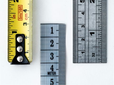
  1. A measuring tape with both imperial and metric, then a ruler with only metric, and another ruler with combined units
    Article post type

    The Best CSS Unit Might Be a Combination

    We don’t have to choose between px and rem for spacing

    There are many articles and established CSS best-practices that rely on determining the correct or best units to use. Now that comparison functions are well supported in CSS, we don’t have to choose.

    see all Article posts
  2. diagram of the box model, content inside, then padding, border, and margins.
    Article post type

    Don’t Inherit the Box Model

    It’s time to stop spreading this out-dated practice

    Setting the box-sizing model to border-box is one of the few remaining CSS ‘resets’ used across most projects. But there are two common approaches, and the more popular choice will cause more problems than it solves.

    see all Article posts
  3. Miriam gesturing as she talks in a video thumbnail
    Article post type

    Visualizing Responsive Typography

    What do all the numbers in our clamp() do?

    There are multiple tools that can help create a fluid font-size calculation for CSS – generally expressed as a clamp() function combining em (or rem) with vw (or vi) units. But the results are difficult to understand at a glance, so I wanted to visualize what’s going on…

    see all Article posts