Skip to main
Link
A close up of the hands of a person handing a package
to another person.

Sass Package Importer (Request for Comments)

A new proposal for importing from NPM packages in Sass

UI libraries like Vuetify and Bootstrap make it easy to extend their themes by providing Sass source files with their NPM packages. Now, Sass is requesting feedback on a simpler way to import those libraries into your Sass styles with e.g. @use "pkg:bootstrap".

Read the summary & proposal »

Many UI libraries provide Sass source code alongside JavaScript in a Node.js package, so that users can customize package styles or themes. There hasn’t been an easy way to specify that a file to be imported is from an installed package, so build tools have provided a variety of ways to import from a package and define where packages are installed.

This has meant that switching build tools might result in unexpected gotchas, or that many more potential paths need to be checked to see if a file exists at that location.

The Node Package Importer will allow users to specify with a pkg: URL that an import is in a Node.js package installed alongside their source code.

@use "pkg:vuetify";

When a Node Package Importer is added to the importers for a compilation, this directs Sass to find a Node.js module called vuetify, and import the default Sass file defined by the vuetify package.

I’m excited by what this provides library authors – this makes it much more straightforward to expose Sass source files, and to expect that users can import those files, regardless of their setup.

It also allows library authors to take advantage of package entry points, so they can specify exactly which files are exposed, and at what paths.

For instance, an author could expose the file at ./src/sass/themes/_dark.scss in a way that would allow someone using the package to simply write @use "pkg:my_package/dark".

This also uses conditional exports, so package authors can specify a Sass default entry point that is different from their JavaScript entry point.

I look forward to this feature shipping, and making integration easier for both package authors and users.

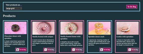
  1. Baseline Bakery: as sweet as Interop. Demo to view donut products as a small grid, large grid, or list with an optional To Go Bag sidebar.
    Link post type

    Container Queries and Units in Action

    One of the goals when writing CSS is to build component parts that will adapt well to different (and unexpected) contexts. Ideally, a component can be placed inside any “container” element without it feeling broken or out of place. How can you accomplish this in a complex layout like a…

    see all Link posts
  2. A graph showing font size and zoom effectiveness versus viewport width. The font size, calculated as calc(17px + 2.5vw), increases linearly with viewport width. The 500% zoom line, representing the maximum possible zoom, shows that zoom becomes less effective as viewport width increases, failing to provide a 200% font size increase beyond a viewport width of 2040px.
    Link post type

    Responsive and Fluid Typography with Baseline CSS Features

    As designers, it makes sense to think about what space is available in the browser, and adjust your typography accordingly. It’s also important to remember that different users will have different font-size needs – and the more a font size is responsive to the viewport, the less responsive it will…

    see all Link posts
  3. Indoor plants in pots on a floating shelf
held up by brackets.
    Link post type

    Sass Indented Syntax Improvements

    Bringing SCSS flexibility to .sass files

    The Sass indented format is getting more flexible with the ability to have multiline statements, semicolons, and more.

    see all Link posts